Data Visualization
Modern reporting platforms have evolved from the world dominated by spreadsheets and rows and columns to a more robust set of tools at making data approachable and easy to digest. Making data informative and actionable is best done through the use of data visualization by presenting users with the information they need to see in obvious and intuitive formats and navigating them to the details as necessary based on clear navigational standards.
Successful enterprise platforms go beyond having the best data quality inputs and work to operationalize data by getting it out of dated reporting formats and into dashboards that empower business decisions. Makitran uses tools like Tableau, SAP Lumira or SAP UI5 analytic pages to enable your business to get the most out of enterprise enterprise investments.
Feature capability snapshot
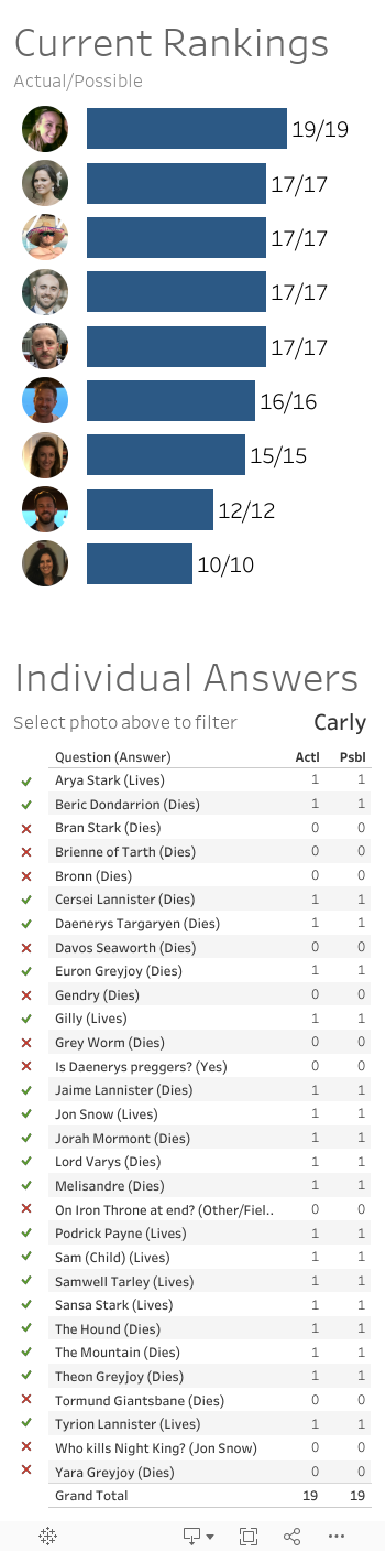
Example Tableau Dashboard developed for Game of Thrones Season 8 fantasy sports style game

Using Tableau to increase enjoyment and engagement with data is a core focus of Makitran data visualization outcomes.
During the final season of Game of Thrones, multiple groups have been using the remaining characters in fantasy sports-like manner by competing on guessing which characters will make it through to the end of the season.
Initially this was distributed in a PDF among a group of individuals. Using Google Forms to replace PDF submissions, then storing data in Google Sheets allowed for shared access to submitted data.
But by taking that a step further and cleaning the data for Tableau and posting results to Tableau Public, this allowed all participants to experience immediately after each episode their current status and compare to others in the preferred mobile format similar to other fantasy sports platforms.